|
Graduation Standard, Middle Level, Arts - Creation Performance
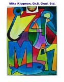
package title: Example of completed Creation Grad Standard:
Abstract Painting Featuring Color Blending Designed for the Middle level Graduation Standards.
Note: Sentences in italics define and explain terms and concepts.
TASK 1: BRAIN STORM TO ESTABLISH CREATIVE
In this visual art creation, each person will explore personal design "symbols" or "icons." These symbols will be used to form the design elements of the work. This visual art creation will require a divergent approach to design. Each artist will use brainstorming to develop alternative designs from which one design will be approved and developed. Each person will brainstorm ideas by sketching a graphic image to represent aspects of personal interests or personality traits. The graphic icon must be an interesting shape that will fit well in a larger design. The more ideas to choose from the better. The best symbols are "interesting" as shapes and interesting because of the personal meaning you associate with the symbol. PROCEDURE FIRST DESIGN TASK: Make eight small OUTLINE DRAWINGS representing a particular aspect of your personality or interests. (HINT: What you like; and, What you are like.) What is a symbol or icon? A symbol is a representation of some object or thing which can represent another idea or meaning. Symbols are used not just used in visual arts but in many art forms including movies, literature, poetry and advertising. An icon is the graphic representation of a symbol. We are familiar with the many icons which computers use to identify programs and actions. We have another term "iconography" which looks at how forms are represented in a symbolic way. Early Christian depictions of Christ were called icons. These were not photographic representations of a man but more symbolic in their form. In the arts of primitive cultures we see representations of the most important cultural forms represented by the people. Such as the whale and fish icons used in carving by of the Indians of the Pacific Northwest coast. TASK 2. SELECTION AND COMBINING SYMBOLS TO ACHIEVE AN ABSTRACT DESIGN This visual art performance applies an approach to abstraction which was used by early twentieth century artists. This form of abstraction produces a cubist effect and breaks up spaces by freely over lapping the symbols. The first task developed icons with your personal meanings; this one combines those icons in a variety of ways. Select 5 or 6 of the best 8 symbols. Choose the symbols on the basis of interest and design possibilities not which are the easiest. Make 4 complete and different designs using the chosen shapes. Each sketch produces possible options. The best of the 4 sketches will be used to make a full sized design. SIZE OF FINAL 12X16, OR LARGER. Abstract design can be achieved by placing shapes so that they overlap, intersecting other shapes. This Cubistic method used by Picasso, Braque, Juan Gris and many others. When a subject is abstracted but remains recognizable it is called semi abstract (partly abstract). There are some creations whos subjects can not be identified. These are pure abstract. Your designs will be semi abstract images. Achieving a good visual arrangement in your picture: (design) When you are organizing your design you will consider the harmony, contrast and emphasis within a picture space. The beginning artist usually does not think about design in any formal way but simply feels that it right or not right. Here are some of the features that make a good design: Variety: more than one kind of shape, size, movement, or color. Contrast: the same element is compared. Noting differences in that element. Example; size contrast, large and small; movement contrast, horizontal and diagonal; color contrast cool and warm; tonal contrast light against dark. Rhythm: the effect of repeating shapes or lines so that the outlines form a pattern of movement. Example- horizontal movements repeating suggest a landscape and rhythm. Harmony: The sense that all of the parts fit together (have a sense of unity or oneness.) Emphasis: The part of the picture that seems to attract the eye. Emphasis can be achieved by size, line direction, tone, color or another kind of contrast. TASK 3: PLANNING AND APPLYING DOMINANT COLOR & ACCENT COLOR In this visual art creation you will apply knowledge about (1) dominant colors (2) accent colors, (3) cool and warm colors, and (4) mixed color gradations. Each of you will select a dominant color scheme to apply to his or her painting. *What are dominant colors? See below: Whatever your dominant color harmony may consist of it is always advantageous to introduce a small amount of an accent color which is of the opposite (contrasting) kind. To illustrate this a warm color harmony may be accented by a small amount of cool; dark color harmonies are enhanced by the addition of light- toned colors. *Dominant color refers to the colors in the majority of the areas being related in some way. The color can be related by hue (the name of any color); by tonality (the darkness or lightness of a color); by a cool or warm designation. Cool colors have a blue hue content and warm having a yellow or orange content. TASK 4. APPLYING AND MIX COLOR FOR COLOR BLENDING TO PRODUCE COLOR GRADATIONS You will use color paint (poster - tempera) and apply with blended color mixing. Colors that you choose will be mixed on a palette accurately then applying paint skillfully with a brush and blending color gradations in each picture area. Gradation of color are color blends that can range from light to dark using a single hue or from one hue to another. The method involves placing new colors next to the previous color and blending them in gradually changing blends. Color blending is a skill and as such requires practice to make a better and smoother color blends. Charles Pinkney, 2001 Wheaton Public Schools CHECK LISTS TO USE AT THE END OF THE PROJECTTASK 1: BRAINSTORMING TO CREATE PERSONAL ICONS
TASK 2: ORIGINAL COMPOSITIONS
TASK 3 ACHIEVING A COLOR HARMONY WITH DOMINANT AND ACCENT COLORS
TASK 4: PAINTING METHOD AND BLENDING SKILLS
Local Standard Assessment: Analysis and Interpretation of ART FORM (1) Creative method, brainstorming and personal iconsRating 1 2 3 4 (2) Creating works of art according to preestablished criteria;Composition achieving Cubistic breakup, contrasts and variety Rating 1 2 3 4 (3) Applying appropriate knowledge and skills in the use of the art form or media;Dominant color harmony application and color blending. Rating 1 2 3 4 (4) Attitude and Methodology is consistent with high level of performance and concern with quality; Care, control and development.Rating 1 2 3 4 |
9 18 2003